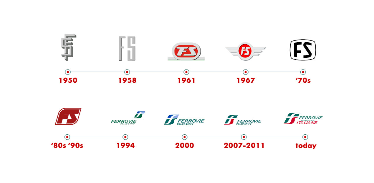
In the 1950s, the furnishings of the Ferrovie dello Stato were branded with characteristic monograms. 1958 marks the first in a long line of FS logo versions. This version was an experimental logo representing a monogram in aluminium against a pearl grey background, applied to a locomotive.
The 1960s saw the corporate logo evolve, and it began to be placed on locomotives in the shape of a green aluminium frieze on the front of the train against a grey background.
1970 saw the logo transform again, to meet the high speed trains. The logo therefore became a frontal frieze in aluminium against a pearl grey background, in the same of a TV set. This logo was already in use in 1965 with X type carriages (passenger carriages).
In the 1980s, the Ferrovie dello Stato logo was changed again. Introduced for the first time in 1982 on X type carriages, this logo was lozenge-shaped.
At the end of 1994, in line with the change of the Group's corporate identity, the logo changed once more to match the XMPR colour scheme, already used by the Group for the furnishings of the new rolling stock. In 2000, the 1994 logo was redrawn in the detail of the edges, while the main form and colours remained the same.
In 2007 we launched an online poll asking people to choose which of our past logos they preferred. The brand made in 1994 was the most popular, and became the basis for future developments. In 2008, the new logo was presented to the public: the original shape remained the same, while the colours were those of the Italian flag.
In the course of an FS Group extraordinary assembly held on 24 May 2011, the company added the term "Italian" to the original corporate name. In contrast, the new adjective was added to the 2007 logo.